
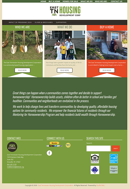
Design is never truly done – it evolves as brands grow, audiences shift, and visual identities strengthen. That was the driving insight behind the recent visual refresh of the East Tennessee Housing Development Corporation website (https://ethdc.org/), where we updated the site to reflect a new logo and color scheme. Back in 2013 when the organization started, we used a theme that has since been deprecated and last year recoded the site to convey the exact look as the old one, as the design was still unique and attractive. However, it did not hold up to mobile-first standards and we had plugins and extra CSS to handle the mobile navigation.
About ETHDC
ETHDC is a community-based housing organization dedicated to expanding affordable homeownership and fostering sustainable neighborhood development throughout East Tennessee. Their mission spans affordable housing development, financial mentoring, and revitalizing communities – a commitment that deserved a digital presence as solid and personable as their work itself.
Why the Update Was Important
When ETHDC updated their logo and primary brand colors, it created an opportunity to bring the website into visual alignment with the organization’s evolving identity – one that feels modern, confident, and community oriented. A strong logo sets the tone for the entire visual system, and the website is often the first place that system needs to feel cohesive. Updating the site’s design to mirror the newest brand elements ensures a consistent experience across all touchpoints.
New Color Scheme & Visual Harmony
One of the core parts of this project was integrating the new color palette throughout the site. The updated colors now:
- Strengthen brand recognition by using consistent hues across navigation, buttons, and accents.
- Improve accessibility with better contrast and clearer visual cues for calls to action.
- Communicate trust and stability, which are essential values for an organization helping families access affordable housing.
This wasn’t just a superficial change – it was a strategic refresh to make every page feel intentional and aligned with ETHDC’s new visual language.
Design Decisions That Matter
Here’s a look at some of the key design improvements tied directly to the new logo and brand strategy:
Branding-First Layouts
- The homepage and key landing pages now incorporate the logo’s shapes and colors into the grid structure and visual hierarchy, reinforcing ETHDC’s brand identity at every scroll.
- Color-Driven UI Components
- Buttons, links, section breaks, and even hover states were retuned to leverage the new color palette, improving usability and delighting the user’s eye with consistent and intentional design.
- Visual Consistency Across Devices
- Responsive design isn’t just about adapting content to screen sizes – it’s about making the design system feel consistent on phones, tablets, and desktop screens alike. The refreshed colors and styles carry across all breakpoints.
Reflecting Mission Through Design
Beyond aesthetics, the design updates help communicate what ETHDC stands for: community, stability, growth, and empowerment. By weaving the visual identity into the user experience — from banners to body text — we ensured the site’s visuals support the organization’s message of trust and transformation.
Keeping the design aligned with the new logo wasn’t just about “looking pretty” — it was about amplifying ETHDC’s mission online, making it clearer, stronger, and more memorable for visitors.
What’s Next
Brand evolution is ongoing, and so is the website. With this visual refresh complete, the site is now ready to better serve current and future homeowners, partners, and supporters — all with a clearer, more confident digital identity that matches ETHDC’s values.
If you’re considering a brand update for your organization and want your website to reflect those changes with intention and integrity, let’s talk about how design can support your goals.
Feel free to let me know if you’d like the post tailored further — for SEO, different tones (technical, casual, marketing), or with more screenshots and visuals!